Robertson Davies once described the serious book person (counting himself among them) as valuing “beauty and associations.” He went on to say that “we should not be sneered at because we like our heroes well dressed.”
It is therefore safe to assume, when we lesser mortals ponder what might define us as one of Mr. Davies’ “serious” book people, that we revel in more than just the journey our literary heroes take us on, or the wisdom they impart, or the heartstrings they tug. Perhaps just as important to us is the way our own collection of heroes, our personal libraries, appear in our lives. Whether piled beside the bed or neatly alpha’d by author or subject or title; as Anthony Powell would say our books furnish our rooms. And do so as much by the clothes they wear as by any diversion they may provide.
In our youth this furnishing begins: the blue-spined Hardy Boys, the eye-burning Nancy Drew yellows, all in their OCD numerical order. Our academic years see the ever-widening row or two of paperbacked Penguins, oranges and greys more-or-less uniform in shade, depending on the cumulative effects of overuse (or like as not underuse), and direct sunlight. Then to our adult library: through years of maturing tastes and flip-flopping interests and guilty pleasures to become a crazy quilt of pick-me-up metallic inks and garish foil stamping, embossed title script, the hurly-burly of cover-as-marketing ploy. As though the publishing industry, in its well-meaning eagerness to induce a sale, any sale, has momentarily forgone fine tailoring for the sake of throwing as much bling at us as possible. “We don’t much care how they look on your shelf,” they might as well say, “just so long as they are on your shelf.”
Yet there shall be no wrist slapping for publishing’s temporary loss of sartorial grace. They are but human, publishers are, and deep down they do care. In fact, every once in a while they remember why they began making books in the first place (and perhaps at the same time recall that blissful childhood moment when they ran a proud little finger along the spines of their own, complete at last, sets of Frank and Joe or Nancy.)
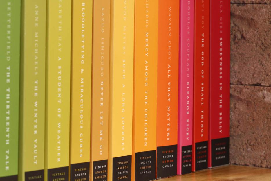
The all-too-human folks at the Random House of Canada paperback imprints of Vintage, Anchor and Emblem (heretofore known as VAE) have recently had such a remembrance. Taking a page from their colleagues in Britain (who had had a similar reawakening, and under the expert design direction of Suzanne Dean produced a stunning library of paperback reprints), VAE have produced a small but stylish set of their own backlist titles. Known as the “Books Are Beautiful” collection, these thirty titles, fiction all, represent the best writing from a celestial list of Canadian and international authors. And for the purposes of the collection, all have been treated to new clothes. All are clad in rainbow-hued covers. Even their metaphoric shoes match: each edition wears their pages with colour-coordinated stained edging (a detail usually reserved for gilt-edged holy books.)
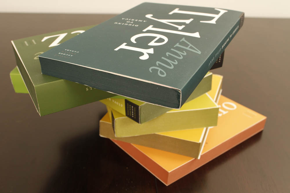
As single editions, their design is a testament to understatement in typography and refreshingly muted marketing copy. For the sake of uniformity (a hallmark of both the aforementioned junior sleuths and the Penguins) author’s names and book titles are treated identically. Logos have been eliminated (in other guises, the books of V, A, and E are decidedly individual entities) and imprints are designated by name alone.
Together on a shelf, the BAB collection becomes a rich swath of hue and tint. A handy visual reference when your crossword asks for the correct order: Richard Of York Gave Battle In Vain. Or a handsome island, floating amid any library’s otherwise broiling sea of clashing visuals. It is as varied a collection of writing as one can own, but what great associations it keeps (Julian Barnes next to Mark Haddon next to Margaret Atwood and back again). Better still: “Books Are Beautiful” is the sum of its parts. A complete ensemble, completely lovely to look at. Well-dressed indeed.

