Late into the evening on Labour Day, as news of Microsoft’s purchase of Nokia’s phone business ricocheted around the web, reaction was swift, and harsh. This is a disaster in the making, went the general refrain.
I’ll leave it to the analysts to parse the truth of those early responses. Mine, however, was strangely more visceral and emotional. I was—I’m not quite sure how else to phrase this—hurt. I have grown accustomed to the odd, obscure beast that is Windows Phone. Attached to it, even. And I don’t want to see it disappear or even be disparaged—not just because I’ve developed some strange technofetish, but because, funny as it sounds, its design helps me make sense of my world.
My day-to-day smartphone is a perfectly serviceable, modern Samsung device. I hate it. I use it, begrudgingly, because it does everything a modern smartphone is supposed to. But to my mind, it does all those things with precisely no sense of elegance, aesthetics, or even a feeling that any thought beyond “here are the features it must have” went into its design.
By contrast, my aging Nokia Windows Phone—which isn’t even running the current version of the software—decidedly does not do what every modern smartphone should. It’s slow, is missing many key apps commonly available on other phones, and even though cameras are Nokia’s specialty, the one on my older model is no good whatsoever. And yet, I still love the thing.
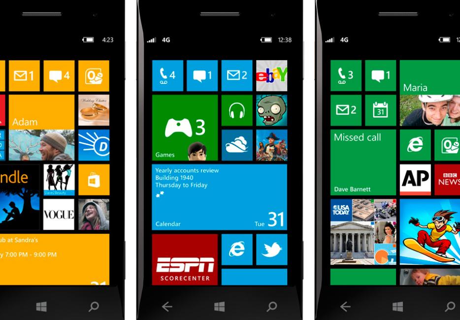
In part, my affinity for it is a matter of aesthetics. Windows Phone eschews the rows of icons and multiple pages of iPhones and Androids for one main screen composed of squares and rectangles of different sizes, with a list of all your other apps in a single list off to the right. Rather than pictures or treatments meant to resemble physical objects, Microsoft’s approach follows the principles of flat design—since aped by Apple—in which clear shapes, fonts and bright colours work together to produce a purely digital look. The overall effect is vastly cleaner and more organized, particularly for attention-addled brains like my own—even an iPad feels visually cacophonic in comparison.
As any iPhone owner will tell you, it’s easy to become attached to objects because of how they look. Becoming attached to software, however, is a bit more strange. And with Windows Phone, the affection you begin to feel isn’t so much toward aesthetics or one particular function but, rather, processes—of movements on a screen, or patterns of motion inscribed into muscle memory. It is the flow of the thing that compels, the way the interface asks for a back and forth between quick, short swipes and taps that leaves one feeling that a smartphone operating system isn’t only a tool, but more akin to an interactive language.
Software is an intermediary between people and the world. As such, screens aren’t a sphere unto themselves as much as a sort of lens onto reality, and the confluence of aesthetics and interaction—even on my clunky old Nokia—shapes that perception in subtle, important ways. It structures a relationship to information.
“But!” the analysts say, “Microsoft-Nokia’s products are doomed!” I’m not convinced that’s entirely true. Assuming it is, though, and Windows Phone heads the way of Palm, WordPerfect, or, probably soon, BlackBerry, what then? If software isn’t just a tool but a window onto life, and picking one is almost like choosing a language or a style, what are we supposed to do when our chosen way of mediating a connection to the world of information disappears?
I don’t have an answer to that—beyond “learn programming,” I guess. But as it stands now, the aesthetic and processual cleanliness of Microsoft’s recent approach helps me to deal with information overload and media glut. Market forces and consumer desire mean that, save learning how to create my own, I might be forced to use a system less suited to my needs. It’s as if I’m presented with this malleable, highly adaptable mechanism for constructing my relation to media, news and the world… and it could, at almost any moment, be taken from me by rigid, entrenched forces far beyond my control.
The conundrum is due in part to the triumph of Apple. Microsoft’s acquisition of Nokia, or the fact that it created Windows Phone at all, is a result of the fact that tightly knitting software and hardware into a vertical silo has become one of the only surefire ways to make money selling computers—something Microsoft has very little experience with, and thus might fail at. All the same, I can hardly complain about the evils of capitalism destroying something I love when the thing being lamented is a product of those same economic forces.
Maybe that itself is the lesson here. Operating systems, software, interfaces—all are languages of their own. As it currently stands, though, those ways of speaking and seeing are entirely subject to the whims of a structure that does not care for the medium of interaction itself, but rather, only for what can be extracted through it.


