
Robert E. McGinnis was a prolific illustrator behind the movie poster for Breakfast at Tiffany’s, magazine illustrations, and over 1,000 book covers. In 1980, McGinnis created the cover for Johanna Lindsey’s Fires of Winter, the first romance novel cover to feature a fully naked man. The cover depicts a couple on a fur rug, the hero sitting on his knees, reclining, with the heroine in his lap. His bare thighs frame her hips and she is leaning back against his bare chest. McGinnis originally had the heroine naked as well, but added clothing at the publishing house’s request. The cover radiates sensuality.
In 1985, McGinnis created the cover for another book of Lindsey’s, Tender is the Storm. The hero is stark naked and turned to the side, his entire body visible from head and shoulder down to muscular thigh. He’s clutching the heroine to his body, his arms strategically covering her breasts, and her breasts and body are strategically covering his groin. The overtly sexy nature of the cover caused concern among booksellers who were worried about the reaction from the public, and a large gold sticker was added to help conceal the hero’s butt and groin and the heroine’s breasts.
These covers, known as the “naked covers,” represent some of the sexiest examples of what has become a romance novel cover cliché: the clinch. The clinch was first used in romance publishing in the 1970s and rose into prominence in the 1980s. Erin Leafe, host of the romance novel podcast Learning the Tropes, says that the clinch cover is often the first thing that people think of when romance novels come up. By the 1990s, the image was replaced by other cover trends, and romance publishing today showcases a wide variety of designs, yet the clinch still looms large in the public imagination.
*
In reality, the clinch is just one facet of the romance novel cover’s history. The roots of the romance novel cover lie in the growing paperback industry of the 1940s. Covers were largely illustrated during this period (and well into the following few decades) by men who worked as artists for publishing houses across multiple genres, including pulp and gothic titles. In The Look of Love, her book on the art of romance novels, Jennifer McKnight-Trontz writes that illustrators had two major concerns during this early period: creating a cover that would be eye-catching enough to compete with a magazine, and creating an immediate visual language to direct the reader to their desired genre, as paperbacks were often grouped by publisher, rather than by genre, in stores.
Dr. Jayashree Kamble, president of the International Association for the Study of Popular Romance and an English professor at LaGuardia Community College CUNY, traces the beginning of category romance brand identity to Mills & Boon, a publishing company based in the United Kingdom. Created in 1908, Mills & Boon published romantic fiction in hardcover. Their romance covers were illustrated and typically depicted a scene from the story. In 1949, Canadian Richard H. G. Bonnycastle created Harlequin. As legend has it, Mary Bonnycastle, Richard’s wife, recognized the potential of catering to female readers through the romance genre. In 1957, Harlequin began to reprint Mills & Boon romance novels; in 1964, Harlequin moved to exclusively publish romance; and in 1971, Mills & Boon and Harlequin formed a publishing partnership. Harlequin began to transform the covers, creating a specific visual language to identify the Harlequin brand. The Harlequin logo was prominently placed, taking up the top quarter of the cover. A cover specific to the story slowly became less common, with the images focusing on the couple involved, rather than revealing the plot in any way.
From the 1940s to the early 1970s, covers were fairly consistent in their relatively demure nature, occasionally featuring an embrace, a kiss, or a couple staring longingly into one another’s eyes. But in 1972, American publishing company Avon made a splashy entrance into the romance genre by publishing Kathleen Woodiwiss’s phenomenon The Flame and the Flower and in 1974, Rosemary Rogers’ Sweet Savage Love. The two novels were sensations, selling huge numbers of copies. The books’ sweeping stories and descriptions of explicit sex scenes are widely credited in the romance world as ushering in a new era and helping to coin the term “bodice ripper”. The phrase arose in response to scenes in historical romance in which a woman’s bodice would be ripped off in an act of sexual violence, and it quickly became shorthand for novels which featured plotlines involving sexual assault (an era of romance which thankfully began to die out in the eighties).
The seventies ushered in the era of the clinch—arguably the most iconic and easily recognizable genre cover in publishing—and it reached its peak in the eighties. A clinch cover features a couple embracing or close to embracing. One or both partners typically have exposed skin and long, flowing locks. This cover type exemplifies the sweeping emotions between the pair around whom the central narrative is based. Other clinch cover characteristics include cursive or stylized fonts for the title and author name and a background or object meant to be representative of the story. The clinch cover embraced design excess and its roots in pulp illustration. These designs play into the public’s idea of the books selling sexuality as uncontrollable desire, says Dr. Kamble, eliciting an almost puritanical societal response.
Beginning in the nineties, romance cover art began to move away from the clinch. For Lindsey’s 1991 Once Upon a Princess, the author’s name takes up a large portion of space in a cursive pink font, the title underneath in green, and a white flower in the top left-hand corner. Amanda Quick’s 1992 Ravished features the author’s name in large dark pink font, a light pink background with a lacey handkerchief, and the title of the book in swirling, cursive font. Lisa Kleypas’s 1994 Dreaming of You features her name in big, bold magenta letters across the top third of the page, an illustration featuring a country manor and a carriage being pulled by horses (despite the majority of the plot taking place in a gambling hall in London) and the title of the novel in bold magenta letters. Julie Garwood’s 1994 Saving Grace features her name across the top third of the cover, in a stylized black font, the title of the book taking up the bottom third, and a bouquet of tulips, tied in a black ribbon that swirls around the author’s name and the title. The use of landscapes, flowers, objects relating to the story and allowing the title and name of the author to take up more space all became more common.
*
The lack of diversity in the romance genre is obvious in the cover art itself, which largely features white and heterosexual couples. In the past, certain genres featured white models affixed with culturally appropriative clothing (for example, covers of the “American Indian historical romance” genre and the “Sheikh romance” genre were particularly transgressive for their use of stereotypes and appropriation). It wasn’t until 1994 that a historical featured a Black couple in a clinch pose on its cover: Beverly Jenkins’ Night Song. Since 2016, Leah and Bea Koch, owners of The Ripped Bodice, an all-romance independent bookstore based right on the border of Culver City and Los Angeles, have been creating an annual report titled “The State of Racial Diversity in Romance Publishing Report.” Major romance publishing companies were asked to self-report what percentage of books they published in a year by BIPOC authors (the report changed in 2021 to remove the self-reporting element, the 2022 report has not been released yet). The numbers are consistently abysmal.
*
While the clinch is an enduring feature of romance novel covers, the most prominent cover trend in present-day romance publishing is the move towards illustrative cartoon covers.
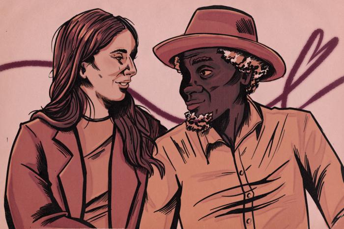
Cartoon illustrative covers feature call backs to the popular rom-com movies of the early aughts. Emily Henry’s Beach Read, People We Meet on Vacation, and Book Lovers all feature colourful illustrations of the hero and heroine facing away from one another in a setting that exemplifies the book. Casey McQuiston’s 2019 bestseller Red, White & Royal Blue features an illustration of the two heroes leaning casually on opposite sides of the cover, and their 2021 novel One Last Stop shows an illustration featuring one heroine gazing out from a subway car towards the other who is walking by, coffee in hand. While many of the cartoon cover illustrations tend towards contemporary, such as Alisha Rai’s 2022 Partners in Crime and her Modern Love series, some historical romances are beginning to use cartoon illustrations as well, such as Evie Dunmore’s A League of Extraordinary Women series, all of the covers brightly coloured cartoon illustrations of regency scenes, and Martha Waters’s The Regency Vows series.
“Bring back the oil paintings that fuck,” Leafe laughs.
Podcast host Leafe feels that something is being lost as publishing houses start to produce fewer of the traditional romance covers. “There’s a desexualization that’s happening in culture. […] That camp and that celebration…as romance has moved into the mainstream, we’ve lost all of that. We’re losing something bigger when we lose all of that.”
The clinch romance novel cover carries dual meaning. In the public imagination and the media, the clinch is a symbol tainted with misogyny. It represents a book primarily about explicit sex and is considered “lowbrow” or “silly.” However, this flattening of the clinch cover into a trope of “soft porn,” as Kamble discusses in her article “Romance in the Media,” loses all the nuance of the image and its possibilities. For some romance readers, the clinch is a radical act in defiance of a patriarchal society that doesn’t value women’s emotional connections or pleasure.