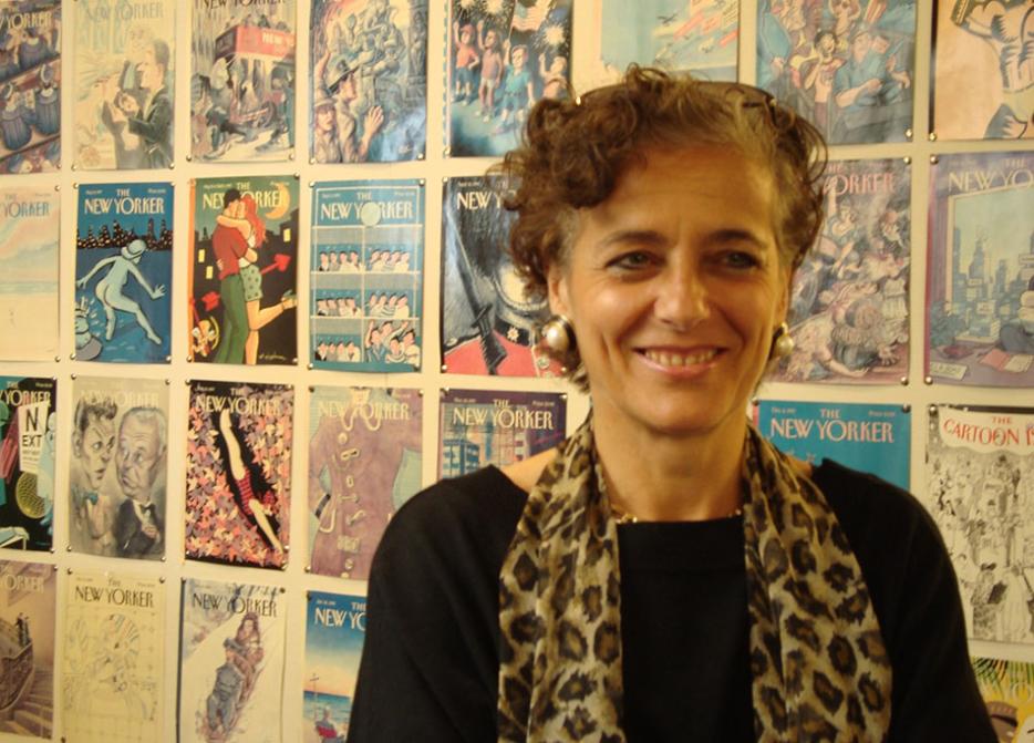
How Françoise Mouly maintains her noticeable composure is anyone’s guess. Seconds before our interview, the woman best known—titularly, at least—as the art director of the New Yorker politely asks me where she can find WiFi, and goes off in swift search of it. A moment later she returns, with a smile and an evident “crisis averted” look. Whatever it had been, it was quickly resolved before her eyes—on her device, through a sequence of progressively assuaging emails.
The moment is unsurprising for someone holding such a high-profile position, but Mouly’s concern seems oddly romantic—rooted in a fierce, and indeed renowned, dedication to art and artists. Before her over-twenty-year tenure at the New Yorker, Mouly made her name as a comic artist and publisher with Raw, the comics anthology she published and co-edited with husband Art Spiegelman. Raw forged a path for the underground-comics movement, which surfaced (and then arguably exploded) with the success of Spiegelman’s Maus in the early 1990s—the same time that Mouly was hired by Tina Brown at the New Yorker.
It was a new dawning for illustration and Mouly was a vital part of it. She began her New Yorker tenure—the most visible part of it of course being the publication’s famous, copy-less cover—by hiring many artists with whom she had worked at Raw: in addition to Spiegelman, Joost Swarte, Chris Ware, R. Crumb and others. She brought back older New Yorker artists such as Sempé and Saul Steinberg. With Brown, Mouly lent an edge to the New Yorker. Its covers became the talk of the town once more.
Mouly has developed a solid stable of artists to whom regular readers of the New Yorker have become accustomed. Two of Barry Blitt’s Barack Obama covers, for instance, are well known: a recent, post–fiscal cliff image of the President herding cats; and, of course, the 2008, pre-election cover of Barack and Michelle in the oval office, he dressed as Osama Bin Laden, she as Angela Davis, with the American flag burning in the fireplace. (It’s a cover over which Mouly regularly expresses pride.)
But the New Yorker is only a part of Mouly’s life. Her other effort at present is children’s literature, and she is extremely passionate about it. She launched Raw Junior in 2000, which published Little Lit, a comics anthology series for children. In 2008 she launched Toon Books, an imprint that describes itself as the first publisher of “high-quality comics” for children ages four and up. The books are hardcover, and done in consultation with educators.
Tying everything together is Mouly’s passion for the illustrated image. In interview, she associates this with all aspects of life. Given her dedication to the physical book and old-school notions of publishing and learning, one might accuse her of overzealousness or even naïveté—had she not been so conspicuously successful in all her endeavours. Mouly’s air is soft but steely. Her lilting French accent and quiet, sleepy beauty recall Charlotte Rampling. After only half-an-hour with her, one has little doubt that she is that rare thing: an ambitious, tough person determined to herald ideals of thoughtfulness, intelligence and sensitivity.
I sat down for a chat with Mouly in the stacks of the Toronto Reference Library when she was in town for the Toronto Comic Arts Festival (TCAF) last week.
It’s been interesting researching your career; there’s so much there. Do you think, if you had been able to look ahead thirty years ago, that you’d be surprised as to where you are now? Was a trajectory apparent?
I would be surprised that there’s so much consistency! Because years ago, I was acting out of passion. I had no idea where this would lead. I was mostly reacting to people who said, “You can’t do this”—it’s not like I had a vision. I would have been unable to predict that we would succeed to the extent we’ve succeeded. I certainly would not have predicted the kind of recognition that Art got. He was just as smart and articulate thirty years ago, but he was a lone voice in the wilderness. Now he says the same things and everybody’s like, “My god, he’s a genius.” But he hasn’t changed. It’s simply that so many more people are able to hear it.
I’d never have predicted his book would become so entrenched. Not only in terms of being accepted—it was inconceivable to do a comic book about the Holocaust. You couldn’t even think of wanting to do that; it was so outrageous. Now, it seems to be the cornerstone of an entire shelf in the library! There are so many comic books about the Holocaust. So that, I couldn’t have imagined—let alone the shape, the almost immutable format of memoirs. Art chose a format for Maus that didn’t exist. No one had done a book that was trade-paperback size with French flaps, a 200-page continuous story. So the fact that not only would it be accepted but that almost every other cartoonist on earth would attempt to do his or her graphic novel, as if that were the only way you could do comics—that’s strange.
Also, the fact that the publishing industry, the print industry, would collapse was not even conceivable. When I had a computer in 1980, it was a tool; it wasn’t driving, you know? It was something you used to do something, not an end in and of itself. But through all of this, the permanency of the actual book in the two areas I’m interested in—one is comics, and the other is books for children—is just as essential thirty years later. These things somehow remain when everything else has turned to rubble. Heidi MacDonald just published an article in PW about how graphic novels have become the hottest thing for librarians. That was not even possible to think of.
And now Art has a touring retrospective. That must be strange to see but also gratifying.
It really is. I sympathize with him because there’s a danger in finding oneself entombed in one’s own success. I’ve had many friends and people asking me to do an anthology of Raw, or turn towards the past and what it was like then, but it’s really not interesting to me. What I’m doing now is so much more interesting to me. That’s something that I feel very grateful for: that I find what I’m doing now just as difficult as what I was doing then; that, no matter how many genuine, gratifying accomplishments, there’s still such a sense that there’s so much left to do in the fields I’ve chosen. Fighting for good books to be put in the hands of kids: there are many books I publish that I feel like, if I didn’t do it, nobody else would. I’m really grateful for that—keeps me alert.
Tell me more about the children’s-lit imprint you’ve been working on for the past few years.
I’m in a strange position where I’m the art editor of the New Yorker. It’s the best magazine in the world, has contributors of the highest caliber, and I’m responsible for the cover of that magazine. It’s as visible as it gets. But I still have a hard time getting comics published inside. I’m in competition with the journalistic reports, and all the editors are fighting for more pages. And there’s no room for children’s literature—of all the missions the New Yorker it has, that’s not one of them.
It’s a very adult magazine!
Very much so. It doesn’t consider itself a family magazine. Some magazines do, but not the New Yorker. So it’s very complementary for me. I feel that for two reasons. I did Raw Junior in 1998, about five years after I started the New Yorker. One reason was to keep my hands in publishing, on a first-hand basis. As much as I value my position at the New Yorker, I’m part of a team. There’s something in me that is eager to have something that I’m solely in charge of; that’s my thing, where I don’t have to compromise or argue.
Also, it’s something I get to produce myself. I choose the paper and the format, the author, and create a book object. I can’t do that with the New Yorker. I’ve tried. I’ve done everything I could, but we run over a million copies a week. It’s not taken well when I say things like, “Hey! Let’s do a five-colour Pantone die-cut!” I’ve done as many things as can be done. But I like the idea of still having the handmade process a small press can provide. In the 21st century there’s something magical about an artist who can actually create content with a pen. There’s something so pure about a drawing that captures the imagination and enters into the cultural dialogue. For kids to be good citizens in the twentieth century, they have to be visually literate.
There seems to be a commonality to all your projects: Raw, which pushed the envelope of comics culture; the New Yorker, the covers for which enter a broader cultural discourse; and your work with children’s literature, which attempts to reach out and shape a formative experience of reading and images. These are all influencing roles. Is there an aspect to your work in which you’re trying to… not indoctrinate, but enrich?
I think that if you set out with a scripted outcome, you don’t succeed. I’m acting out things that work on me. I spent most of my terribly unhappy childhood years immersed in books. I found early on that it was a great way to escape any kind of arguments with my parents or emotional upheaval. I loved reading and being lost in a book. I trained as an architect. As an architect you’re part of a team and no architect can build a house by themselves. But a bookmaker can make a book all by themselves. And an author: look at my husband’s book, or Marjane Satrapi’s Persepolis—she manages to convey a very rich world, and her personality is very well expressed in a book that shows her handwriting, that has a sense of her.
In a way I got a very classical education growing up in France in the sixties, and learning Latin, Greek, French and English. But I’m well versed in the technological part of the 21st century. The common denominator for me is stories, narrative structure. That’s how I understand things. I find them, books, the right recipient for something that is both complex and nourishing. I watch movies and enjoy them; I watch, you know, The Wire and TV shows, but still, the stories I read in books inhabit my brain in a special way. Those characters are very present in my thinking. And children’s books are a very real part of how I think. So I find it a privilege to actually be in communication, to leave a trace of something that’s actually going to be read.
On that note, two interesting things I’ve come across that you’ve said: “Fifty per cent of the image is actually when it is looked at and read” and “Cartoonists have to use clichés.” One of the perennial issues in publishing, but especially now that we’re facing this supposed crisis and death, is that there’s a lot of second-guessing about a general readership. Who’s the reader? Who’s the viewer? There are a lot of editorial and publishing meetings about what “the reader” wants and is going to think. But you wonder, ‘Who is that person, really?’
It’s an interesting question because at the New Yorker, since the magazine was launched in 1925, we’ve managed to refine things, as an identity. We’re a repository, a filter, for high-quality content. And as interested as we are in our reader, it’s not interactive in quite that sense, even though it spurs us on. For example, the cover: the sketches are looked at by the checkers with a very critical eye. Everything in the magazine is looked at with a very critical eye, because we’re going to get those letters saying, “Oh, on that sailboat your artist drew, the sails are shown going the wrong way” or something. Unbelievably learned and savant! The readers are interacting with the magazine in a more expert way than the writers who are being published. It forces you as an editor to really be on your toes and to take your readers very seriously.
So it’s a little different and a more salutary interaction than only publishing to get the most emails and the most-read things—to play by the numbers, and if something has a huge following then you give it a bump. At the New Yorker, at least you still trust yourself as an editor, even if people don’t vote for everything you do. You still appreciate something as an interesting piece. That’s a fine line to be able to sort through all of the information.
There’s something in my sense of what a publisher can do, which is very old-fashioned, which is that the publisher can follow specific sets of interests. It’s one of the things we did in Raw, putting together interesting cartoonists, whether they be European or American or Japanese, all the different traditions. Intentionally, we didn’t define a house style. Quality was the common denominator. Also, each artist we published had a unique voice. That was really important because it wasn’t just a matter of the content, the forms that it took, a way of drawing or approach to narrative or character. It was a matter of having use. There is a sense of entitlement that the cartoonist doesn’t have. Chris Ware said it best: “When I’m at a museum and I’m looking at a painting and I don’t understand it, I think I’m an idiot. But if I’m reading a comic and I don’t get it, I think the cartoonist is an idiot.” And in that sense a cartoonist is not entitled to be towering over his audience. The cartoonist is actually engaging in a fifty-fifty. Certain expectations have to be met and they have to communicate. He or she is not just answerable to his own inner demons. Even if the story is personal it’s still a form of communication. That’s mandated from the moment that you decide you are going to be printing it.
You must follow the news assiduously. Working at the New Yorker as long as you have must have changed your brain in some ways.
Oh yes. I’m so up on things. But you know, working at the New Yorker, I don’t make those covers. I’m in a dialogue with the artists who make those covers. It’s a back-and-forth. It’s knowing and listening to people and listening to what they propose.
Some weeks I’m sure it’s obvious or becomes obvious what the subject of the cover is going to be. Does it cross your mind, in terms of the event being addressed, that, like, “This one’s for Barry, for Art, for Chris, for whomever?”
To some extent. But you know I’m very pragmatic, so whatever works. When I entered the New Yorker, my predecessor said, Well here’s how you do it: you accumulate a stack of drawings, then you go see the editor and they say yes and you put those ones on the right and they say no and you put those ones on the left, and then the ones that have been chosen, you schedule them for the next six weeks. Well, that’s definitely not the way I do it! From the beginning, I had to find my own methodology.
Pretty much when I started, covers were only vaguely related to the season but not much of that, really—and absolutely not timely. And the editors, starting with Tina Brown, wanted something that was more responsive to events. It’s not predictable like TIME or Newsweek. It’s not a news magazine in that sense. And that’s great because we only do a timely image if we have something to say. There have been a number of events, for example the Aurora shooting, where I sent out various calls and talked to various artists and didn’t find an image that I felt was worth doing, so we didn’t do it. And that’s OK too. We don’t have to respond to every blip on the news cycle. But it’s a big privilege to be able to select an artist who genuinely has something to contribute that goes beyond the obvious.
The other thing that’s great with the New Yorker covers is that they are somewhat autonomous from the rest of the magazine. So there could be an article about the Aurora shooting, a think piece or something, but no corresponding cover. Also there are no words, so the image has to be self-contained and explain itself and communicate what it’s about. It has to read very quickly because it’s on the newsstand and you get it in your mailbox. Again, to use Chris Ware’s words, it’s no good if people come to me and say they have no idea what a cover is about and ask me to explain it. It forces a dialogue with the reader; the reader has a certain expectation; but with the images that come, and many artists send many sketches, many more than what gets published, it’s a search for good ideas. Because I work with the best artists in the world, after that it will almost inevitably turn into really good pictures. What’s hard is to find good ideas. But fortunately at the New Yorker it’s a forum that’s rewarding and challenging enough that the artist devotes the energy necessary. The image enters broadly and they get a lot of response.
So, then, how often is the process collaborative between you and the artist? I know that Christoph Niemann’s cherry-blossom cover about Fukushima was changed from a white to a black background to suggest a darker mood.
It really depends on the artist. There are artists where there’s an extensive back-and-forth. But there are some artists where we touch nothing. For example, we just published a cover by Chris Ware. At some point with my team we noticed there was a tiny piece between the shoes of one of the characters that was a little darker, so we corrected it and told Chris but he told us it wasn’t a mistake—that it was intentional, a shadow! So we reverted to the original.
There’s an example of someone where there’s absolutely nothing to add or change, because he’s figured it out. There my contribution is pretty minimal. Then there are other artists where it’s different. There are a number of covers by Barry Blitt for which he sent me two or three different versions and I built one that is none of the above but a little bit of each one. The goal is that all of this be totally seamless and each image be the best expression of what the artist has intended. And if I do something, it’s not to appropriate it into my own narrative but to put myself in the service of what the artist is saying.
You mentioned before the start of the interview that you were preparing a special animated cover of the magazine for the iPad by Christoph Niemann. As somebody who is known for hand-crafted, careful and often very beautiful work, what is your relationship with digital technology as it pertains to publishing?
It’s a good way to make print objects known. For the kids’ books I use e-books; I do all kinds of online versions; I have extensive websites, all sorts of resources. It’s a great, great tool. I spend my life on a computer—I hate it but I do it! But, if it’s an end in and of itself, then it’s a snake that swallows its own tail. It can become suffocating. But as a tool to actually disseminate information, it’s great. Some things exist best in the ephemeral online version. But if you’re talking about a book and the story and something for children…
I heard Frank Cammusso talk this morning. He’s done many children’s books including some Toon books and he was talking about his three-and-a-half-year-old son, and when it comes time for bedtime, he can’t read him something on an iPad, because the iPad is a portal to excitement. He wants to go on YouTube and knows how to navigate it. That’s not what he wants for his son at bedtime so he brings in this printed book, and that’s where the book has this unique quality of being always the same. It’s graven; every time you turn that page the same image will appear. You can move it back and forth and hold it up and of course it doesn’t need to be plugged in and can be read in any kind of light; it has a kind of universality and permanence. And it can be the same book that Dad read when he was a child.
I just released Blown Covers last year, a book of sketches for New Yorker covers that weren’t published, and the only reason I was able to do this is because twenty, fifteen, ten years ago, everything was sent to me as faxes. So I have a piece of paper with those black-and-white sketches. More and more artists are sending me digital files and instead of doing thumbnails they’re sending it in colour and I’m not printing it or keeping it. I wouldn’t be able to search for it and they disappear from my brain the moment I see them. Whereas a little black-and-white thumbnail, I can keep it and remember it; it has an iconic quality.
You were mentioning symbols and clichés: what is interesting to me about visual representation in comics and in cartoons is that it is units of thoughts. One of my big privileges as the New Yorker art director was to be Saul Steinberg’s editor. Steinberg said that what for him was very exciting, was that if he did a drawing that succeeded, it shaped the way you thought. So his View of the World from Ninth Avenue: once you have seen it, it imprints itself and becomes a vocabulary. You can’t remember not knowing that concept. You’ve acquired a new concept for chauvinism and narrow-mindedness that is now embedded in your brain.
The contest you’ve been running with the Eustace Tilley covers: this year’s Brooklyn dandy cover has, for me, certainly changed how I see that image.
That’s a good example, actually. Eustace Tilley: that drawing was done in 1925, and when I first looked at it I saw in it what everyone else does—haughty sophistication, looking down upon the common mortal. But when I learned more about Rea Irvin and I looked at the covers done right after in 1925, I realized the magazine was positioning itself for F. Scott Fitzgerald and the flappers: those were the ones represented on the other covers. The dandy with a high collar is based on a drawing of the Comte d’Orsay from 1840, so about hundred years before 1925. They’re mocking fuddy duddies, the grandparents who are looking down on them because they’re so hip, so young.
It’s through the years that it somehow gets taken at face value, through the reader of the New Yorker, and its shift from Harold Ross as a humour magazine to a highly respected magazine of journalistic pieces—as if the New Yorker is not mocking fuddy duddies but has become the fuddy duddy. In 1993, we had a drawing by Charles Burns where he does a totally exploded, grossly visceral version of Eustace Tilley and next year R. Crumb did his version of Eustace Tilley as a punk in Times Square and Art did one of him as Dick Tracy and Ana Juan did one of him as a woman. Through all these variations, you open up this icon, this cliché, into something that can mock itself, which is a breath of fresh air, and also acknowledges women artists, writers, a younger readership—a much broader, more inclusive readership. Clichés are interesting because they’re reduction and simplification and in this way become ciphers for ideas.